Street Photography
Bruce Gilden
Bruce Gilden is a street photographer who is best known for his close up photographs of people on the streets of New York using a flashgun. He uses an old-school style of photography which is confrontational and in your face, and with 40 years of experience he is a master at it. H has different 'books' which include series' of photographs within the name of it and his most recent one called 'faces' is pretty extreme. These include a series of portraits of people who are battered and bruised form life situations, or from addictions like alcoholism. I think that our of all of his 'books' this one has the most impact because they contain such detail which makes you look at all of the different components of life and the people photographed.


|
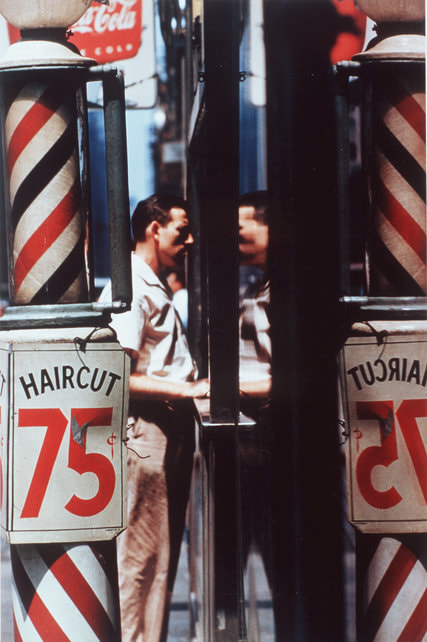
My favourite photo is the one on the left because I think her posture and expression shows more about her then any other of GIlden's photos. The way she looks into the camera is as if she is looking right at you in real life and her expression and posture shows me she is worried or shocked and is grabbing the kitten for comfort. I also really like the colour contrast between the woman and the background because I think it brings the photo to life. |
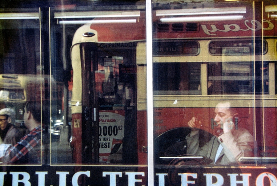
Saul Leiter
Saul Leiter was a pioneer of colour photography when he was alive and his work was described as swift, sharp and precise. He used a Kodachrome colour slide film to take his photos and he combined a muted palette with soft focus or stronger primary colours and hues with deep shadows, that enabled his tones to pop with vibrancy. Unlike any other street photographer, Leiter's photography takes on more of a bystander's approach and simply overlooks things that happen around him, a little like narrating the photo. Leiter also uses more empty and negative space in his photos to make them more different and he also frequently takes his pictures through panes of glass and from obscure angles as well.


|
My favourite photo is the one on the left and it shows a suited man on the phone in what looks like a cafe, behind some glass which is reflecting a bus which is passing by. I really like this photo because the abnormality of the composition interests me. As you can only see the man's reflection, it portrays him in a ghostly manner and I also like the bright red and yellow colours of the bus fin front because I think it adds good contrast to to the faded man behind. Finally, I don't think the photo has a very clear focal point, however I can see that lines in the photo lead your eyes towards the man in the bottom right hand corner.
|
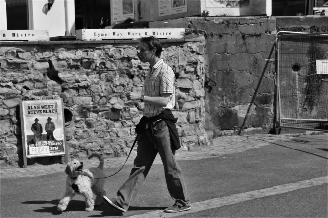
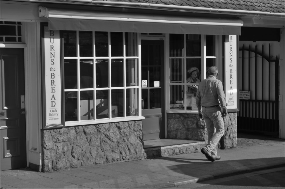
Bruce Gilden and Saul Leiter Shoot
After looking at both Bruce Gilden and Saul Leiter for the shoot I will be doing I have decided to try out both photographer's preferred methods. I really like the way Leiter takes his photos as a bystander and I am also intrigued by the surprise element of Gilden's photography so that is why I have chosen to try out both.
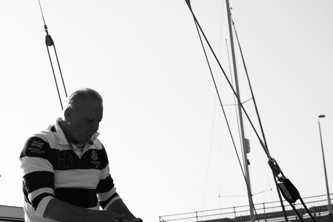
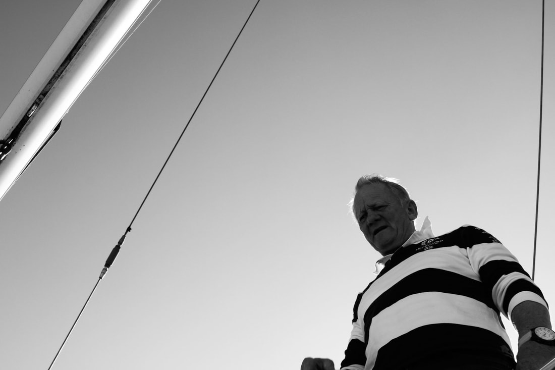
For the 'Bruce Gilden' part of the shoot, I will be photographing my friends and family because I do not yet have the confidence to take up-close photos of strangers just at the moment. However for the 'Saul Leiter part of the shoot, I will be going around public places and taking my photos there. I really want to focus on negative space and reflections in Leiter's photos.
I will be using my Canon 750d camera to take the photos for the shoot. For Bruce Gilden's photos I will be using a shutter speed of 1/1000 so my photos are sharp and the same for Leiter's too. I want to use a flash as well for the portraits so they replicate the ones of GIlden's but for Leiter's I will be using natural lighting. For both shoots I will be using an aperture of f22 and and and ISO of 100 so my photos are not grainy, but clear.
Below are some examples of what I want to recreate.


Shoot


I am really happy with these photos because I think they replicate Gilden's and Leiter's photography well. For this shoot I took all of my photos in Plymouth and I mainly focused on Saul Leiter's approach because I personally preferred it to Bruce Gilden's however I did try to incorporate Gilden's approach to, however for those I just used my family and friends.
Edits


With the editing, the only adaptions I made would be to greyscale the photos because that's all Gilden and Leiter did in their photos and this shoot about replicating the work so that is all I did. Even though this is a very minimalist editing move, I do think it gives a very good and dramatic affect to the photos.
For most of them I will be greyscale in the photos and editing them into black-and-white however for some of them I think they look much better in colour with enhanced brightness because it adds a better affect and some of Gilden's photography alongside Leiter's, did use colour very affectively in their work.
For most of them I will be greyscale in the photos and editing them into black-and-white however for some of them I think they look much better in colour with enhanced brightness because it adds a better affect and some of Gilden's photography alongside Leiter's, did use colour very affectively in their work.
Final Images and Evaluation
|
|

Lines
Many photographers use lines in the photos to add more of an impact to the images and also serve an importance in composition. They lead the eyes all over the page and across the photo and they can affect your mood, by doing this they keep the viewers attention focused on the image and nothing else.
Horizontal lines tend to make you feel more relaxed and they give a sense of lack of change and repetition. They also provide a contrast with the more dynamic parts of the image, this is my photos of the sea and waves and landscapes usually make people feel calm.
Vertical lines usually show very strong and implied meanings and can sometimes feel quite chaotic and busy. They can also represent height or infinity especially if you don't see the top of them (you can relate that with religion). Unlike horizontal lines, they don't represent movement but in fact represent stability and security.
As you can see, lines play a very important part in photography because they add a lot more emotion to the images. There are the types of lines such as diagonal (which give a sense of dynamics and more movement) and irregular and jagged lines (gives feelings which are uneasy, negativity and tension) however vertical and horizontal lines are the most commonly used and most effective.
Eric Kim
One photographer Hughes lines and his photos is Eric Kim. His main theme for his photography is a combination of street photography, personal photography and abstract photography and he wants to be remembered for educational information which helps people to empower humanity.
|
This is one of Eric Kim's photos and it's one of my favourites because of the specific emotions I get from it. The composition shows of grey and cloudy sky, some bare trees, are worn down house and offence, and airy man and a long pathway surrounded with grass. The main focal point is the man stood at the end of the pathway because of the vertical lines either side of the path lead you up to him. I like this photo because the man's legs are crossed and I think that makes the photo little bit more abstract and usual and also because the vertical lines of the Paul elongate the man's legs to make him stand out even more. This photo makes me feel a little bit on easy and scared because of the overall dark and airy theme of it and the editing. I also believe Kim has used the role of birds to add an extra facts and composition saying is the man and the pathway seem to be directly in the centre of the middle third.
|

|
Lines Shoot
After looking at the work of Eric Kim, I am now going to try and replicate some of his photos in my own shoot. However, I am going to make some of my final photos in colour and not all in black-and-white to add my own touch to my images. I will be taking my own photos on the seaside and around the beach to try and include photos of the sea which include horizontal lines and I am also going to use natural lighting to create compositions which use lines effectively.
For the shoot I'll be using my Canon 750 D camera which will allow me to adjust the focus and create a depth of field. I will be mostly using the manual focus on the lens, a small aperture of F 22 so everything is clear and I can make the photos in focus and out of focus as I wish, however I might change it for some of them, I will also be using an ISO of 100 so there are no grains in my photos too.
Below are a few examples of what I am trying to re create.


Shoot


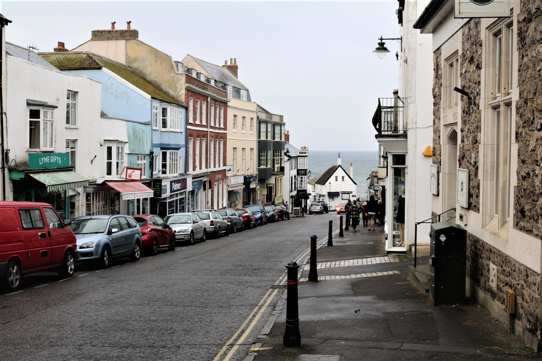
For my shoot I went to a beach to take my photos like I said before and I'm really happy with them. My aim was to take street photography photos involving lines and I think I have achieved that with my own twist. As the main high Street was steep and long, I took photos down the hill to try and emphasise the steepness and are used a row of cars and lines to make the viewer look across the photos. I also use rows of beach huts and shopwindows to make the same effect in a different way.
Edits


For most of my edits like I said before I want to keep them all in colour to maintain the effect that they had, so therefore for most of my photos I increased the brightness and the contrast of the colours to make them stand out, I also increased the shadow set of photos were lighter and I cropped them to make them look more effective. However for the one photo of the beach hut I also added a blue undertone to make the other colours stand out and I think that adds a lot more perfect, also for the photo of the shop I edited that into black-and-white because I thought that would look better because the photo in itself is quite crowded in the shop windows and I thought that colour might add to the clutter so I left that in black-and-white and I think it looks good as it.
Final Images and Evaluation
|
|
I am really happy with my final images because they're exactly how I wanted them to turn out like. I really like the colours and the effect of the photo going down the High Street and I like the tone and positioning on the second photo of the beach huts. If I were to do that shit again, I would experiment with people in the photos and with more black-and-white edits to see the different effects they would give compared to the coloured ones.
Rule of Thirds
One of the fundamentals of photography is the role of thirds, this is the technique which is designed to help photographers build drama, interest and attention to the photos and also make the piece is more aesthetically pleasing and satisfying for the viewer. The rule states that the piece should be divided into nine squares of equal size, with two horizontal lines intersecting them across the two vertical lines.
Below are some examples of photography which uses the rule of thirds affectively, as you can see in most of these photos the rule is very clear and visible to see.
Below are some examples of photography which uses the rule of thirds affectively, as you can see in most of these photos the rule is very clear and visible to see.


|
This photo is an example of photography which includes a strong use of the rule of thirds, the photographer is an unknown person however it was created in the 2000s. You can see that the photographer has cropped the photo so that the man is on the left, this draws our eyes to him as the main focal point is in the first third where the man is, however it also gives us some more freeing sense of space throughout the whole photo with the empty space being in the second third and last third. The wooden poles have also helped to point out the use of the rule of thirds to seeing as they seem to split the photo horizontally into three pieces, before grey-scaling it to add more emotion.
|
Rule of Thirds Shoot
After looking at the work by various different photographers, I now intend to create my own shoot on the role of thirds. I will be adding my own touch the photos by taking them at train stations and various other places. I will be using natural lighting to take my photos and I'll be looking to create compositions including the role of thirds and it will be used effectively in my photos.
I will be taking the photos using my Canon 750D camera which will allow me to adjust the focus to how I would like it and to create the shop plus the time looking for. To do that I will be using manual focus and an aperture of F 32 for a deep depth of field and clarity. Finally I will also be using an ISO of 50 to avoid any grains in my photos so that there is clear as possible.
I will be taking the photos using my Canon 750D camera which will allow me to adjust the focus to how I would like it and to create the shop plus the time looking for. To do that I will be using manual focus and an aperture of F 32 for a deep depth of field and clarity. Finally I will also be using an ISO of 50 to avoid any grains in my photos so that there is clear as possible.
Shoot


I've taken the photos from my shoot, I am happy with them. I think that they show good use of the rule of thirds and that the compositions are affective in portraying so. I like the usage of negative space that I have used as the sky and some of them on the different shapes that are used as well to create another effect.
Edits


For the edit I will be using colour in my final images so I would like to emphasise the colour and the lightness in my photos, to do this I will increase the brightness and contrast to my photos to make the colours pop in stand out. I will also be increasing the highlights to add yet more brightness and avoid any shadows and I will be cropping the photos so that the rule of thirds is very visible and clear to see.
Final Images and Evaluation
|
|
I am really happy with my final images because I think they are good examples of photography which includes the rule of thirds as its main subject. I really like the intensity of the colour in the photos especially of the sky because I think it adds more intensity to the overall photo as a whole, and I also like the use of a depth of field in another photo. If I was to do the shoot again I would aim on editing more and using different editing techniques to improve my skills.
Street Photography Photographer Comparison
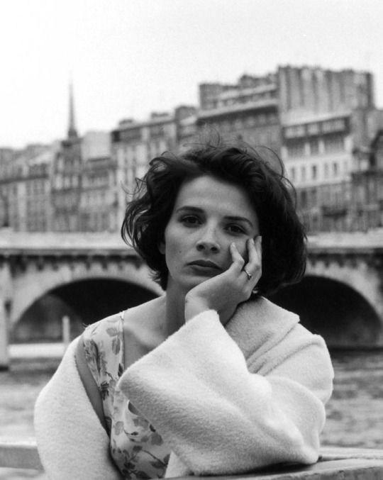
Saul Leiter
|
Saul Leiter was an American photographer and painter who's early work in the 1940s and 1950s was an important contribution to what came to be recognised as the New York school for photography today. He's a man photography was to take photos acting as a bystander I'm not actually in the photos themselves, a little out of the frame and overlooking what is going on in the photos. This was a very unusual type of photography when he was around, however it has gotten more popular over the years.
|
|


Robert Doisineu
|
Robert Doisineu was the French photographer who used a Leica camera on the streets of France. He was a champion of humanist photography and was renowned for his 1950 image 'Le baiser de l'hôtel de ville (kiss by the town hall), A photograph of a couple kissing in the busy streets of Paris. Doisineu was appointed a Chevalier (knight) of the Legion of Honour in 1984 as well.
|
|


|
|
The similarities between these two photos are the main focal points and the compositions. Both photos include people as the main focus which shows that they must've been the most interesting thing to photograph at the time of the photo was taken. Seeing as the photographers have quite a big age gap in between them, this shows that the times haven't really changed that much in that sense at all The similarities between these two photos on the main focal points on the compositions. Both photos include people as the main focus which shows that they must've been the most interesting thing to photograph at the time of the photo was taken. Seeing as the photographers have quite a big age gap in between them, this shows that the times haven't really changed that much in that sense at all.
Rule of thirds is also a very clear and present technique that is being used here as you can see, and so lighters photo the man seems to be placed in the centre third with the Potaba left bed and its reflection to the right. Likewise with Roberts photo, the woman also seems to be centred in the middle third with the bridge and buildings behind her fading into the background using the techniques of back ground, middle ground and fore ground. This helps the viewer to look older on the photos and all of the different aspects which are in them and not just at one point.
Finally, I can see that both photographers have used quite a shallow depth of field to enhance their photos considerably. Leiter's photo seems to have a shallow depth of field compared to Doisineu's Photo, because the background is much more sharp however I think it adds more character to the photo. Doinineu's Photo looks good with a slightly blurred background because it adds more softness to the image overall which could possibly replicate the woman's personality or how she supposedly being betrayed us, this could also support the fact that her arm and hand is placed gently on her face looking very soft. However the sharpness looks really good in Leiter's photo because it enhances the colours and also the mood of the photo as well.
Plan for the next few shoots
For the next few shoots I'm going to be trying to make my own photos on street photography with my own twist. My aim is to take pictures which cover for dark and possibly crowd to town because I think those photos of the most dramatic and give off the best effect. Below are a few examples of what I'll be trying to replicate my work around.


Street Photography: Shoot 1
After looking at many different photographers and their work on street photography, I am now going to take some of my own photos within that theme. My aim is to take photos that give us the dark and sinister time like I said before, and to make them look as professional as possible. I will be taking them around the area and where I live and they will, and will not include people (mixture).
Photo shoot I will be using my Canon 750 D camera to take the photos and I want to use much natural lighting as possible. I will use the shutter speed of 1/2000 to ensure my photos are shop as possible and then when I edit them, the colours will be clear and dramatic and bold. The aperture will be F5.6 so my photos are not too bright but they will be light enough, and the ISO will be 100 to avoid any grains in my photos. To develop my shoots I will be focusing on different things each time, for the first shoot I want to focus on people and crowds and for the second shoot I will be focusing on more architecture and buildings, this can help me develop my skills in which looks better and adds more effect, architecture and buildings or crowds and people.
Below is a mood board containing a collection of photos I wish to replicate.


Shoot


I am very happy with my photos because they are beginning to look like my final images I have in my mind. I managed to take different types of photos in different situations with different people to create a variety of effects. My aim now is to edit them to make them even more dramatic and intense.
Edits


For my edits, my main goal was to greyscale the photos and make them more dramatic and add more effect by enhancing in the black-and-white colours and the contrast and I think I have achieved that.
Firstly I grey scaled the photos so they were in black-and-white and then I increased and decreased the contrast, highlights, and shadows to get my desired effect.
Firstly I grey scaled the photos so they were in black-and-white and then I increased and decreased the contrast, highlights, and shadows to get my desired effect.
Final Images and Evaluation
|
|
I'm really happy with my final images because they're exactly how I wanted them to look and turn out. I really like the fact of the black-and-white editing because it gives the image is much more drama and intensity, it also makes the photos look much more professional.
If I was to re-do the shoot again, my main goal would be to try and take more photos of individual people and not just focus on the crowds.
If I was to re-do the shoot again, my main goal would be to try and take more photos of individual people and not just focus on the crowds.
Street Photography: Shoot Two
After looking over my previous shoot, I have decided that for my next one I will focus on more architecture and not people. This is because as I was taking my photos for the previous shoot on people, I was more drawn into the buildings and the people in the crowds and I think that by changing my main focus point, I can elaborate more on my editing skills and different angles at which I can take my photos to improve.
I mainly want to focus on old architecture and shops because I think that they will give of the most emotion once they've been edited and finished compared to new and modern buildings.
For the shoot, I will be taking the photos using my Canon 750 D camera with a standard lens. I also want to use as much natural lighting as possible like before and the shutter speed of 1/1500 so my photos are clear. To make sure the photos are also not grainy, I will use an ISO of 100 and an aperture of F5.6 so they aren't too over exposed.
Shoot


I'm quite happy with these photos because they're exactly what I want them to be like. Are use many different language to create different effects and I also use a variety of ages of types of buildings to create different emotions to. I feel like the old buildings such as the cathedral and the churches will create more open old and worn down the fact I'm a modern buildings will seem very clean cut and sharp.
Edits


For my edits my main goal was to still make my photos more dramatic, however I thought that some of the photos looked quite nice in colour so therefore I decided to colour edit them as well as a side-by-side comparison to the black-and-white ones. I will not be using the colour edits in my final piece considering my whole theme is on making my photos dramatic,however I wanted to see if they look any better in colour.
The weather edited them was very similar to before (increasing and decreasing the highlights, shadows and contrast and great Scaling them) however for the colour edits, I increased the colour intensity to maximise the effect that way.
The weather edited them was very similar to before (increasing and decreasing the highlights, shadows and contrast and great Scaling them) however for the colour edits, I increased the colour intensity to maximise the effect that way.
Final Images and Evaluation
|
|
I am really happy with my final photos because they turned out better than my original hopes and I also prefer the shoot to the previous one because I enjoy taking the photos much more and I feel like they give of such a better effect. I really like the detail that you can see in the cathedral on the buildings which adds to the drama and intensity.
My favourite photo is the middle one of the cathedral because I think it is really intense and like I said before, you can see all of the different details of the cathedral. If I was to do the shoot again, I would focus more on shops to make it more 'street' related.
My favourite photo is the middle one of the cathedral because I think it is really intense and like I said before, you can see all of the different details of the cathedral. If I was to do the shoot again, I would focus more on shops to make it more 'street' related.
Evaluation
I am very happy with my two street photography shoot because I managed to create and follow through my style of drama and intensity throughout the whole mini project.
For the first shoot I was focusing on primarily people and their role in my photos as the main focal point, which I then edited into black-and-white. I think that this was very effective in the photos because it gave a sense of overcrowded nurse and the hustle and bustle of daily life today, however for the other photos it reminded me a little bit of salt lighter because of the individual people and shooting the photos through the shop window and from a bystanders perspective. Although I was editing the photos, I think you change the mood and tone intensely in a good way.
For my second shoot, I focused more on the architecture side of street photography and my aim was to really emphasise the sheer size and detail in the buildings was I photographing, and I think I did that well. I wanted to mainly focus on old buildings which had character, such as restaurants, houses and cathedrals and then highlight the certain natures of them whilst editing. I think that because Cathedral gave us the biggest impression on the viewer because of the pure detail and magnitude of it in the photo.
If I was to re-do this project again, I would probably focus on more individual people for my first shoot, and more old buildings similar to cathedrals for shoot 2 because these are what I think expressly and I sentiment best within the photos.
Below are my two favourite photos from each shoot.

|

|
Shoot 1 Shoot 2
The Human Condition: Fragments
With our new topic being 'The Human Condition' I have been thinking about all of the different possibilities and routes I can take within the project which i can appreciate and elaborate on. I have chosen to focus my area of this on 'fragments'. This is because the idea of people and society as whole has become fragmented is a very true and saddened part of our lives today and I want to portray that in this aspect of my work.
These shoots that I take will include the ideas that someone's mind can be fragmented, including the factors of mental health, instability (being both mental and physical) traits and personalities. It will also involve the physical and life factors including places and the dramatic split in society which divides the wealthy, the not so wealthy and the homeless.
Overall I want my photos to have an impact upon viewing and a meaning behind them. The tone of voice will be a meaningful one, and one which will tell a story about the object, place or person being photographed because I want the viewer to really think and take in the messages which are being portrayed within them.
I see this project going through physical and mental aspects of fragmentary to make people think, by doing so I will be experimenting with many different editing tools too. These will include slicing up the photos into different shapes and sizes and creating collages with them, harsh editing colours to create more impact and drama and some more subtle editing which should also have the same effect, but in another way of its own.
Down below is a collection of five photographers who have inspired me in lots of different ways for this project, some of which in their style of photography and some in what they photograph.
   |
|


Composition - Plan
After looking at the work of 5 different photographers relavent to my theme of fragments, I have decided to focus on Reynald Drouhin's style of photography for my first shoot on composition. I really like his style of photography for my first shoot on composition. I really like his style of landscape photography which includes geometric shapes which become more abstract when you edit them. I like how when you look at them, they make an ordinary photo more interesting and they sometimes make you want to turn the photo around and look at it from different angles. Below are some examples of his photography.
|
|

|
|
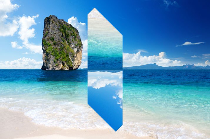
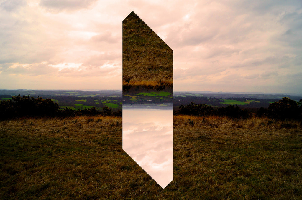
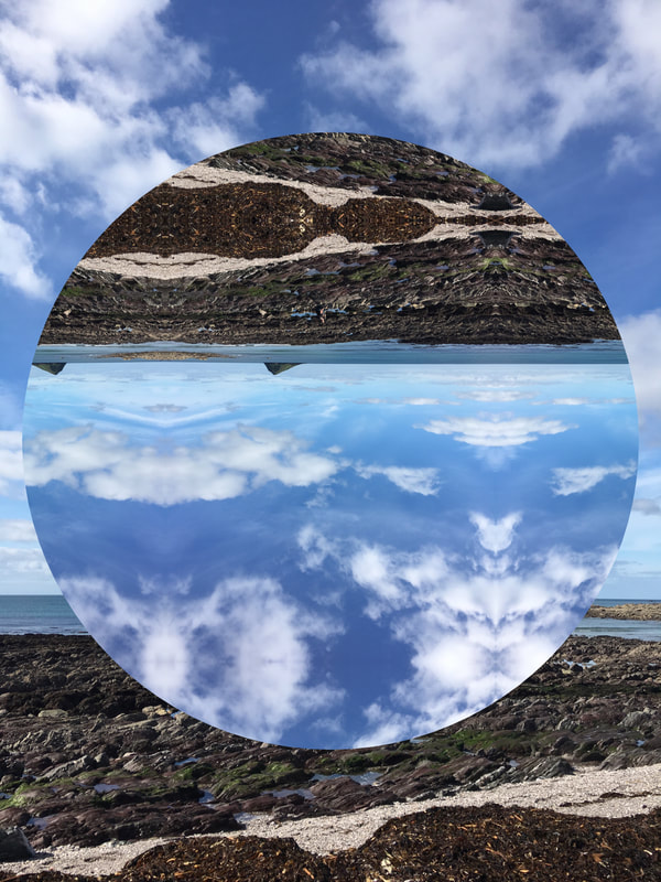
I have decided to focus on this photo by Reynald Drouhin because I really like the effect it gives. Drouhin is a photographer who mainly takes photos of the beach, skies and countryside landscapes and then edits them to include geometric shapes which flip the photo upside down inside it.
All of the photos are taken in landscape and many of them have a split going down the middle of the photo usually being the horizon or the split between the sea and the sky or the land and the sky. This creates a boundary in the photo, adds contrast to the photo in the two halves and also helps to guide the viewer across the photo. This photo uses natural light, like most of his photos do, which add a softer tone to his photos overall. Which contrasts against the harsh lines of the shape which is edited in. Drouhin also uses all of the same shapes in his photos to make them more original and more like a series in themselves, this also helps to distinguish his work from others. I will be trying to use this style of composition in my work further on, however for now I think I will be experimenting with various different shapes to look at the different effects and tones they add to the photos. |

|
Shoot


When I was taking these photos, I was trying to focus on the more natural side of things with nature but I couldn't really get much besides my house because Glastonbury Festival traffic restricted me to my house, however I took some photos of the beach a week ago for this shoot which I have included.
Edits


To edit these photos, I used an app called 'Fragments' to help me. This enabled me to choose the different shapes I could use and then edit the photos further to my preference.
Firstly I chose my three favourite photos, then I chose different shapes to layer on top and I then edited the positioning of the shapes and the orientation of them to make them look better. I did also have the opportunity to edit and change the actual photos but I decided to leave them as they where originally to make them look more like Drouhin's.
Firstly I chose my three favourite photos, then I chose different shapes to layer on top and I then edited the positioning of the shapes and the orientation of them to make them look better. I did also have the opportunity to edit and change the actual photos but I decided to leave them as they where originally to make them look more like Drouhin's.
Final Photos and Evaluation
|
I am very happy with my final images because they turned out exactly what I had hoped. I really like the one on the left because I think the horizontal line going across the middle of the page (the horizon) shows a clear split between the sky and the sea and provides a good contrast to the photo. I also really like the second photo because I like how the soft and curvy lines of the coastline are contrasting with the harsh lines of the geometric shape in the middle. I also slightly edited the actual photo to have a 3d colour effect which I think looks good. If I was to do this shoot again, I would perhaps try creating a series with the same shape like Reynald Drouhin and possibly try portraiture and see how that turns out.
|
Foreground, Mid-ground and Background
David Hockney has inspired me for my next shoot alongside Sohei Nishimo because I feel like their style of photography will make this mini project more unique and different.
They both use a style of photography which involves talking many photos of one place/person from many different angles, and then adding them all together to create a big and abstract version of the photo they took photos of in the beginning. I think that this will be really effective because you will be able to see all of the different layers of the photo (which is especially important in this topic being fore, middle and background). I also think this will also add a 3D effect to the photo as well.
Like I said before, Sohei Nishimo and David Hockney are my inspiration, however Hockney focuses more on people and Nishimo focuses mainly on places and I think I want to focus on a place for my next shoot.
Foreground, mid ground and background can also really help to proportionate objects in photos to establish a clear focal point and dominance. Being more commonly used in landscape, this technique is also used in portrait photography too.
|
Below is a photo representing how mid ground, foreground and background work together. For the shoot I will be using an ISO of 320, a shutter speed of 1/1000 and an aperture of f4.5 so my photos are as natural as possible.
|

|
Below are a few examples of what I am trying to recreate.


|
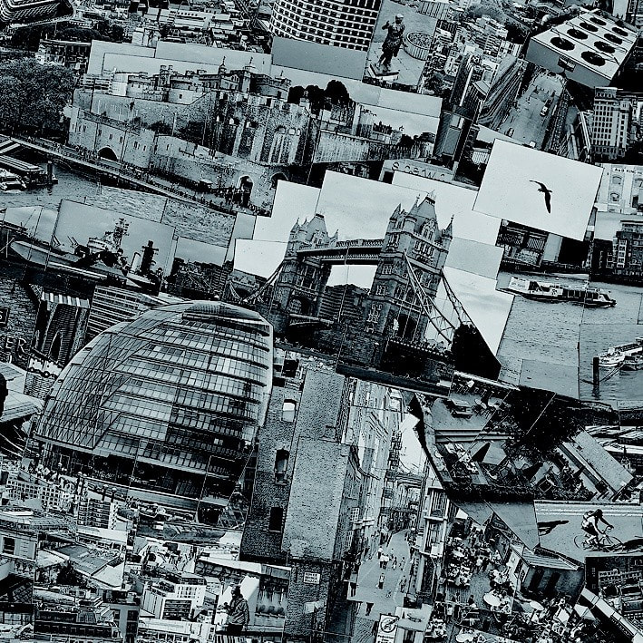
The title of this piece is unknown. It is by Sohei Nishino. It was created in the 2000s. It is an example of photograph with has been taken and put into a collage. The composition depicts many different photos of London and all stuck and photo shopped together into one large photo.. The focal point (most important/eye-catching part) of the image is probably the London bridge. It is placed in the centre of the photo possibly The techniques used here are natural lighting and black and white editing to add effect and drama. The texture in the picture looks quite harsh and ridged because of the harsh lines on the edges of the photo. The photographer has used a traditional DSLR camera has been used I believe, as it was taken in the 2000s to create an abstract image of the city of London.
|
Shoot


As you can see, the photos I took are all mostly the same but this was my aim. This is because next I want to cut them all out individually and recreate another photo I took. Hopefully the photo will replicate on of David Hockney's or Sohei Nishimo and give the same dramatic effect.
Final Photo

Evaluation
I am quite happy with my final piece because I think it is worth the effect. I do like the effect it has and you can feel the layers of each individual photo in the picture as a whole however I don't feel as if it is as clear as I hoped it would be and it is definitely more abstract than I originally thought, I'm not saying that I'm not happy with it, but I'm saying that it could be better then it is. If I was to do this shoot again, I would possibly try it again on a smaller scale and with an easier photo to replicate so I can practice the skill.
Light
Light is a huge component in photography which is really important because without it, it is impossible to take a photo.
There are many different ways light is used in photography whether that be subtle or harsh, like the colour, intensity and direction of it. Different colours of light including blue and purple tones can make a photo look or seem cool and relaxed as opposed to red and orange tones which can make a photo seem emotional or angry.
The intensity of the light can also change the mood of a photo because really harsh and powerful like to make a Photos seem stark and intense and it can also emphasise the person features on them like wrinkles or lines which most people try to hide. However soft light can be used to literally soften the photo and make someone look airbrushed and more 'perfect' in a sense, this is more commonly used in portraiture.
Direction of the lights can also dramatically impact the intentions of the photo as well. If you take a photo of someone with light above the head, it can make the photo look more natural and normal because the Sun is naturally above us so it is what we see on a daily basis and it is normal to us. However if the light is below someone's face then it is the opposite to what we are used to seeing so therefore it can make people see more scary and abnormal.
Olivia Bee and numerous other photographers have use light as their main focus on the photography and work. Here are a few examples of photographers that use projectors and light in their work.
|
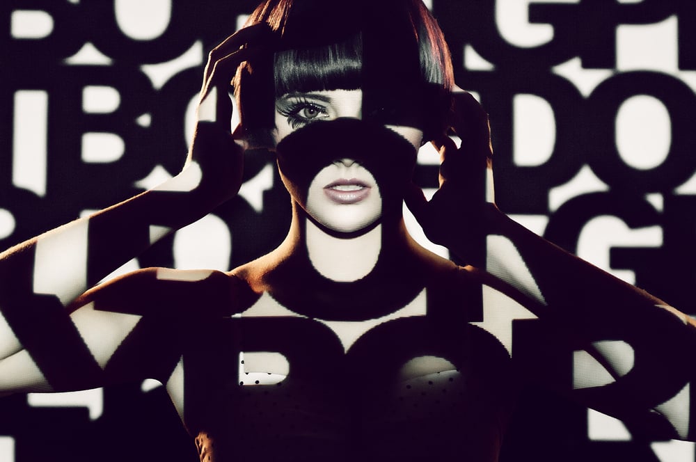
This is an unknown photo by Jane Hicks and is an example of photography using projectors.The composition shows a photo of a woman with her hands up beside her head and a photo of black and white writing being projected onto her face and body. The focal point (most important/eye-catching part) of the image is the woman in the middle because she is the main subject of the photo as a whole. The colours in the image are black and white because they are the colours that have been projected onto the woman's face, however you can see her skin colour but I has been dramatically washed out from the projected light. The patterns I can see in the image are quite disorganised seeing as they are many different letters however I think it gives the effect of patterns instead and I really like it.
|


Above are some examples of this kind of photography.
Light - Plan
After looking at the work numerous photographers I want to create my shoot on the theme of light incorporating my main topic of fragments.
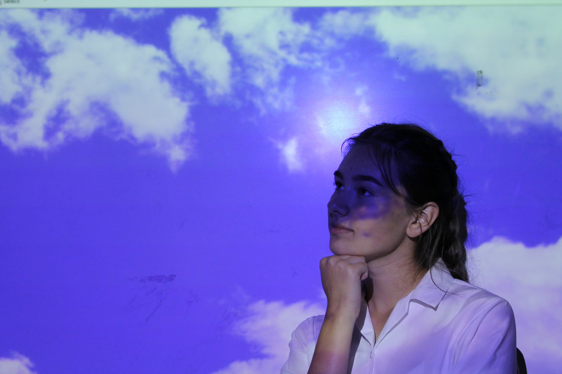
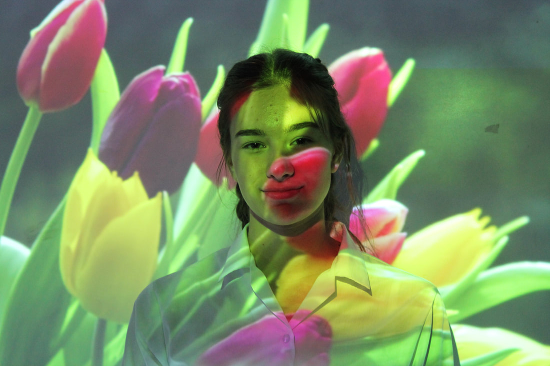
I really like how the use of a projector, projecting photos onto a persons face can make a photo quite emotional, effective and also 3D so I want to use that idea in my work. By using a projector to betray images onto a model space, I can use different photos which hold different emotions and effects show the idea that someone's mind isn't always one mood or emotion or state, but in fact fragmented into many different emotions and feelings in an entire spectrum which can change within an instant.
For the shoot, I will be using my Canon 750D camera without a flash because it might give a flashback on the projected background which I do not want. The shutter speed will be 1/1000 and the ISO will be 320 so my photos are clear, sharp and not grainy.
Shoot


I am really happy with my photos because they came out exactly as I had hoped. I really like the effect they give with the models expressions on them too.
Final Photos and Evaluation
|
|
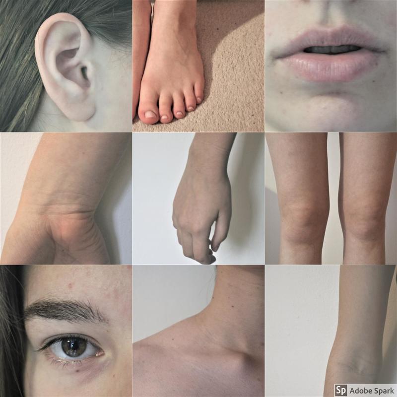
Body - Plan
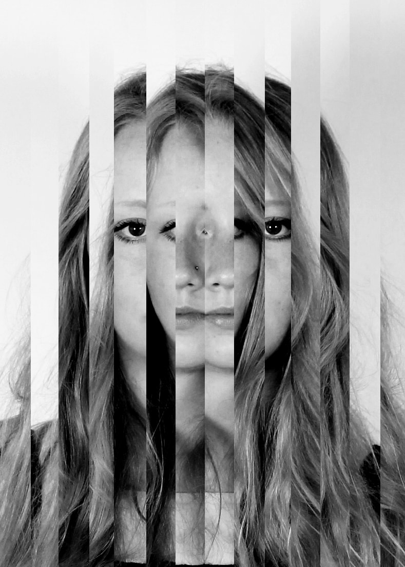
For my next few shoots I am going to be experimenting with different styles of photography and seeing which works best in my work. For this shoot however, I want to focus on the human body and how I can focus on each part of the body and how it all comes together to make us. I will be trying to create broken up collages including the persons body and creating emphasis on their different features so the viewer will focus on them.
For the shoot I'll be using my Canon 750 D camera which will allow me to adjust the focus and create more emphasis and add more detail. I will be mostly using the manual focus on the lens, a small aperture of F 22 so everything is clear and I can make the photos in focus and out of focus as I wish, I will also be using an ISO of 100 so there are no grains in my photos either.
For the shoot I'll be using my Canon 750 D camera which will allow me to adjust the focus and create more emphasis and add more detail. I will be mostly using the manual focus on the lens, a small aperture of F 22 so everything is clear and I can make the photos in focus and out of focus as I wish, I will also be using an ISO of 100 so there are no grains in my photos either.
Shoot


I am very happy with my photos because I think they are god to work with. I like the pale white background I used because I think it helps to accentuate the figures more and add more effect. However, I'm not so sure I like the photos of the feet purely because I don't like the background of the carpet seeing as its cream and textured but I will try and resolve that problem in the editing,
Edits


For the edits I haven't really done too much because I wanted to keep the photos looking natural and I wanted all of the effect to come from the photos being split apart and not from any harsh editing. All I did was increase the contrast in the colours slightly for a clearer and sharper Finnish and I also took some of the colour out so the photos look slightly bland and pale because I think this adds more effect too the photos as a whole and I think they look more aesthetically pleasing as well.
Final Images and Evaluation
|
|
|
|
I am really happy with my final images because I think they are really effective. I used Adobe Spark to accumulate all of the photos into 4 different collages for the each different people and I think they look quite good. I think that my aim of making the human body look literally fragmented is accomplished and I definitely want to experiment more with this aspect to see what more I can get from it because I think it is very effective. If and when I do this shoot again, I would try adding colour and possibly using makeup and paint to see what different effects I can get from it.
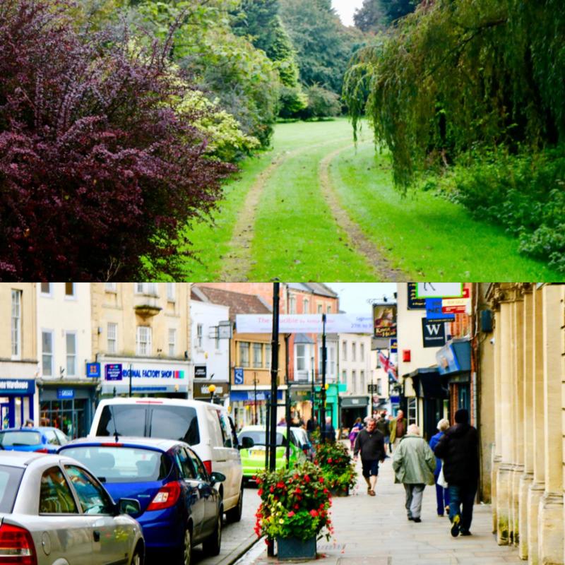
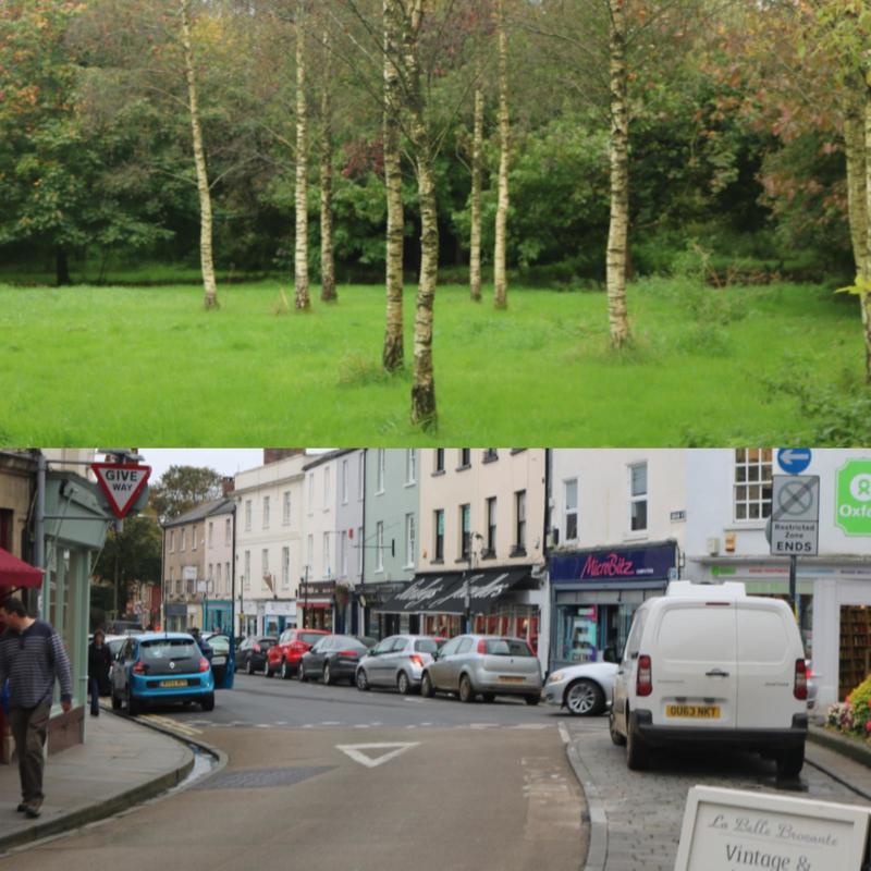
Landscapes and Contrasting Cities
For the next shoot, instead of looking at portraiture, I want to focus on more landscapes and cities and how the world contains so many vastly different places which are polar opposites. I find it fascinating how one area can contain a really busy, populated place which is dense and crowded, and within a certain radius, there could be a bare landscape which is empty and nothing but grass and trees. I have come to realise how much different that is to living In the city and how the two different places are so different and separated from one another and I want to show that in my work.
This ties into my fragments of photography because it shows that the world is fragmented into many places which are different and vary from one another, but the world as a whole, brings them together in harmony. I also think that landscapes are a prime example of areas that are relatively untouched by humans and cities and populated places are examples of places in which humans have adapted majorly which shows the world is fragmented into places which vary profusely and I want to portray these contrasts against one another. I will present my work by taking photos of the two contrasting places and placing them side by side.
For the shoot I will be using my canon 750d camera without a flash so the photos look more natural and I will use a fast shutter speed of 1/1500 so the photos are clear and not blurry. I will use an ISO of 100 and an aperture of f5.6 so the photos are not too dark and they have enough light in them.
Shoot


Edits


For the photos I wanted to just enhance the existing colours and add more effect. I enhanced the lighting and contrast and I also increased the hue on some of them too.
Final Photos and Evaluation
|
|
WWW: I managed to create effect through editing and putting photos together.
EBI: I look at other photographers which I felt more passionate about.
EBI: I look at other photographers which I felt more passionate about.
Colour filters
After looking at how landscapes and cities differ from each other, I want to see how layering things over the lens will effect the photos I take. emotion-wise. I am not very happy at all with my previous shoot because I don't feel like I did it whole heartedly therefore meaning it wasn't of my highest standard so I hope this shoot will be better.
This shoot will take me back to the idea of literally taking photos of people to tie into the human condition and making the photos different by using different colours of wrappers (quality street) to fragment the photos from what we are used to seeing. Using this physical filter over the lens will show how we as human fragment our characteristics to fit into society and different situations. This will enable me to continue on with this topic in further shoots to come and experiment more on covering ourselves with filters, metaphorical and physical.
For the shoot I will be taking portraiture photos of people through different coloured lens using different objects to cover and effect the lens of the camera in different ways. This, I hope, will give the effect of both the human condition and fragments as a whole.
For the photo shoot I will be using my Canon 750d camera with manual focus to ensure I have control over what is blurred and which is not in the photos I take. I will also be using a shutter speed of 1/1500 and 5" because I want to experiment with blurred photos as well as sharp to see what gives the best effect. The aperture I will use will be f5.6 to ensure my photos are light and clear and an ISO of 100 so there are little to no grains throughout the photos.
Shoot


I am really happy with my photos because they are much, much better then my previous shoot because I think they are more effective. I used quality street wrappers as a DIY filter over the lens to add a colour tint to the photos which I really like, I think they yellow tint makes the photo seem aged and old too. I think my favourite colour of filter is probably the yellow or the pink because the yellow makes the photo looks old, and the pink makes the blue eyes pop which adds a slight contrast within the photo.
Edits


To edit these photos I used an app called Photofox which allowed me to edit the brightness and shadows of the photos, and It also enabled me to layer photos on top of each other too add an extra effect. I firstly increased the brightness and clarity to the photos so they could be seen better, then I chose to layer the photos on top of each other. For the first two edits I used photos of the same colour to layer and then adjusted the positioning of the layered photos to add a glitch/ghostly effect, however for the third edit, I used two photos that had different colours which worked really nicely because they have created a new colour of green within the photo.
Final Images and Evaluation


WWW: I am really happy with my photos because I think they are considerably better then my previous shoot, I like the slight cloudy effect the filters give because they make the photos look slightly aged. I also like how easily this ties In with my theme of fragments because humans obviously tie in with the human condition and the photo editing it literally fragmenting the photo.
EBI: Next shoot I will focus more on the layering of photos but with buildings and people instead of individuals.
EBI: Next shoot I will focus more on the layering of photos but with buildings and people instead of individuals.
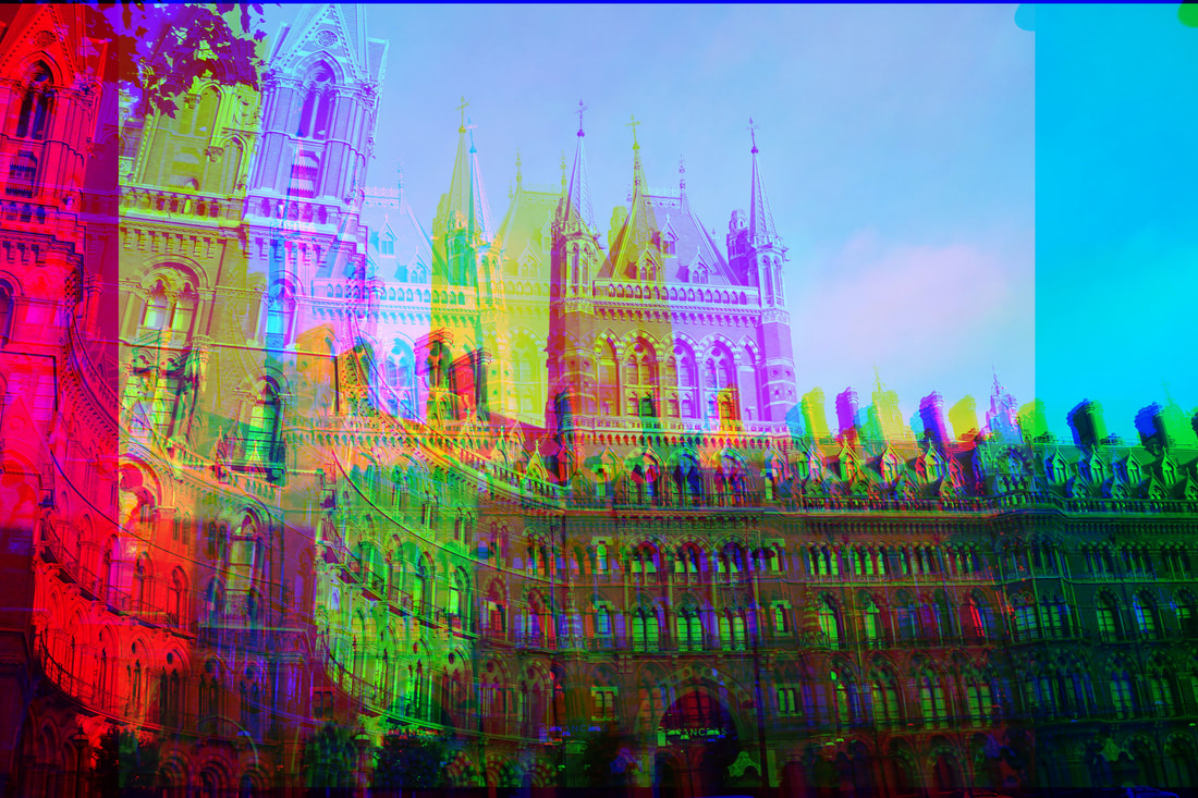
Shoot 7
After successfully looking at how portraiture and colour filters work together in a manner to create good, edited and glitchy photos, I want to keep the idea of using layering and colour filters using the wrappers, but I want to focus more on street photography and see what effect that gives my work. This ties into the human condition because It is man-made buildings and people actually within the photos, and fragments because the photos will be literally fragmented with the layers which will be staggered for added effect.
For the shoot, I will be taking the photos using my Canon 750 D camera with a standard lens. I also want to use as much natural lighting as possible like before and the shutter speed of 1/1500 so my photos are clear. To make sure the photos are also not grainy, I will use an ISO of 100 and an aperture of F5.6 so they aren't too over exposed.
For the shoot, I will be taking the photos using my Canon 750 D camera with a standard lens. I also want to use as much natural lighting as possible like before and the shutter speed of 1/1500 so my photos are clear. To make sure the photos are also not grainy, I will use an ISO of 100 and an aperture of F5.6 so they aren't too over exposed.
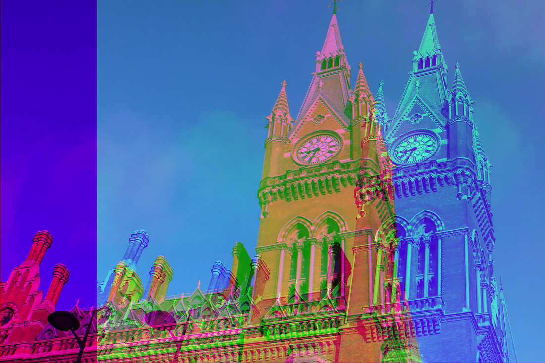
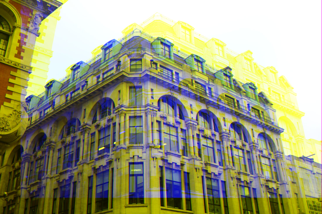
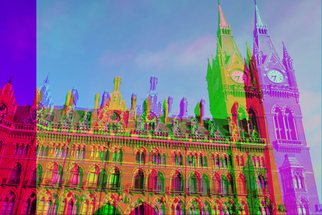
Shoot


I took these photos when I was in London and I was walking around Oxford Street looking at the buildings. I really like the shapes of some of the buildings and I think the detail of them would look good in the edits I will do. I really enjoyed taking these photos because I used different angles and perspectives to make the most effect.
Edits


For the edits, I took apart the different colour layers within the photos and I then pulled them apart from each other and staggered them to create a 3D colour effect. I really like how in some of them they are blurry but I think my favourites are the ones in which there is an exact copy which has been moved to the right like a shadow of some sort.
Final Images and Evaluation
|
|
|
|
WWW: I have found a new way in which I want to develop my ideas and have improved my Photoshop skills.
EBI: I experiment this idea with people and decide and experiment on what I want to do for my final piece.
EBI: I experiment this idea with people and decide and experiment on what I want to do for my final piece.
Mid Shoot Evaluation
So far in this project, I have been concentrating on the sub-theme of fragments within the main theme of the Human Condition. Throughout this project I have been looking at how I can add fragmentation into the photos I take that include the human condition in some way. I have experimented with physical fragmentation; editing/taking the photos to look fragmented physically, and metaphorically; thinking about mental health. After trying out my ideas, I have decided that I want to really focus on the physical aspect of the fragmentation and taking photos of people and buildings that express the human condition in itself to portray my ideas well.
The whole idea of me doing a sub theme of fragments within the main theme of the human condition helps me to show and express my slightly artistic side of photography and experiment with mental health alongside the metaphorical side of it as well.
I think my favourite shoot has to be my most recent one, shoot 7 because I feel like I have really developed my ideas further to create the idea of my final piece in my mind. I like how I have branched out and learned more skills on Photoshop to even more develop my project as a whole and I think It has much more effect then not editing much at all.
For my final piece I want to emphasise the physical fragmentation even more and I want to do something along the lines of cutting the final photos up into literal 'fragments' or turning it into a jigsaw. Some ideas I have are below.

|
|

|
Shoot 8
After looking at the way I can photographically fragment my photos in different ways (such as layering things over the lens and staggering the actual layers in the photos to look 'fragmented') I want to continue on the idea of photographically fragmenting my photos in Photoshop with the colour layers but I want to try out with people in the photo and see what effect that gives and if I prefer it to the buildings. In this shoot I will also experiment with final piece ideas and see what works best for the human condition theme and my sub theme of fragments together.
For the shoot I will be using my canon 750d camera without a flash so the photos look more natural and I will use a fast shutter speed of 1/1500 so the photos are clear and not blurry. I will use an ISO of 100 and an aperture of f5.6 so the photos are not too dark and they have enough light in them.
After I have taken the photos I will be editing them like I have previously done before in Photoshop however afterwards I will be experimenting with ideas on what and how I want to present my work as my final piece. i will be trying out ideas which slice the photos up into 'jigsaw like' pieces and seeing how they turn out and which I like best.
Shoot


For this shoot I used some models with contrasting clothing to the background to add more dramatic contrast and I asked them to have neutral face to make sure all the effect came in the editing. In some of the photos I used just one model to add emphasis on them and in some I used both of them to see what effect that would give.
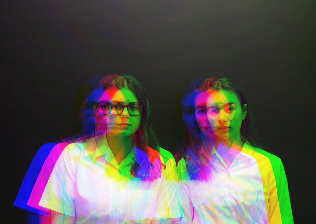
Shoot Edits


For the edits I experimented with the idea of the colour layers in the photos and I wanted to separate them. I think that by separating the layers I entwined the ideas of my sub theme of fragments into the overall theme of the human condition. I used the different channels to stagger and show the different layers in their prime.
For this shoot, the only editing that I will be doing is this because I wanted to continue experimenting with the layers and the picture quality and then I can further develop my ideas later on.
For this shoot, the only editing that I will be doing is this because I wanted to continue experimenting with the layers and the picture quality and then I can further develop my ideas later on.
Final Images and Evaluation


WWW: I have portrayed my ideas well in the final photos and I have edited the photo how I want and they have turned out how I wanted them to be.
EBI: Now I know how I want to edit them, I want to experiment with the different types of extra editing I can do further on.
EBI: Now I know how I want to edit them, I want to experiment with the different types of extra editing I can do further on.
Shoot 9
After deciding that I want my shoot to contain people in I now want to experiment with different types of editing. This means I can incorporate the idea of the human condition in my photos because the photos will be of people and my sub theme of fragments will be interlinked in as well because the photos will be physically fragmented within the physical and technical editing.
After I do the editing on the computer, I am going to print out the photos and slice them up to see what effect they give.
For the shoot, I will be taking the photos using my Canon 750 D camera with a standard lens. I also want to use as much natural lighting as possible like before and the shutter speed of 1/1500 so my photos are clear. To make sure the photos are also not grainy, I will use an ISO of 100 and an aperture of F5.6 so they aren't too over exposed.


For this shoot, I have experimented with taking photos of more than one person because I feel like that will give the best effect. This time I have also toggled the picture quality in which I take my photos to make them as good as they can be. I did take photos of individuals and both together however I preferred the photos of the two people together.
Edits


For these edits I used the same technique as I have before, however this tine I experimented with the different colour layers for the cover photo and the different positioning as well to create different effects. I also used a mixture between individual photos and photos with both people in them to see which ones I prefer. To develop my project I have also cropped some empty space out of the photos to make them look neater and more clean cut and professional.
Final Photos and Evaluation


WWW: I am very happy with my edits and I have a good idea in how I want to present my final piece and how I want to take my photos.
EBI: For my final piece I want to increase the quality of the photos to maximum and try cropping out the empty spa more to create a more developed photo and final piece.
EBI: For my final piece I want to increase the quality of the photos to maximum and try cropping out the empty spa more to create a more developed photo and final piece.
Shoot 10 (Final Piece Shoot)
After doing nine shoots on developing my ideas on how I want my project to finish, I now know how I want to present and take my final photos.
To link in the ideas of the human condition and my sub theme of fragments I have decided to continue taking photos in the style of which I have done in the two previous shoots which include people (human condition) and the editing which separates the photo into my sub theme (fragments) however this time I will be taking my photos on a higher quality setting so my photos are sharper than before, to develop my ideas and I also want to further crop out the empty space to make the photos look more professional. I want to present my final piece as a series of three photos which will be sliced up within themselves, like a jigsaw, and them mounted onto which foam and them all together onto a black board. I think that this layout will give my final piece an obvious look to what my theme is and also a professional finish.
For my final shoot I will be using my Canon 750d camera to make sure the photos will be as good and as clear as can be. The shutter speed will be 1/1000 and the ISO will be 320 so my photos are clear, sharp and not grainy when printed and I will be taking the photos with a dark, black background to ensure all focus is on the models and there are not any distractions.
Shoot


After looking at previous shoots, I have decided I want to focus my final piece on photos with both models in them because I think it is more interesting to view, however I did take a few individual ones just in case I changed my mind. The models are both wearing white against the black background as a contrast to add more effect and their facial expressions are plain to concentrate the mood of the photo.
Editing


For my edits, I have decided to use the same technique as before (selecting the individual channels, selecting the photo's colour layers and then staggering the colour layers to add an effect) I also concentrated on a theme of colour in which I thought where the most effective.
Final Edits

|

|
For my final edits I have printed them off and have cropped the empty space out of them so the look more clean cut. In the end, I have chosen to use my edits of the two people because I preferred them to the individual ones.
For my final piece, I have printed out the three photos on A4 photo paper and then sliced them up into slices, random shapes and then squares. I then stuck those photos onto some which foam with some sticky back tape and then finally mounted those photos onto a black board.
For my final piece, I have printed out the three photos on A4 photo paper and then sliced them up into slices, random shapes and then squares. I then stuck those photos onto some which foam with some sticky back tape and then finally mounted those photos onto a black board.
Final Piece and Evaluation


During this project I have looked at the work of various different photographers such as Reynald Drouhin and David Hockney by searching for different ideas I had. From their work I have learnt that experimentation is the key thing to do to improve and develop my ideas.
My theme was the human condition which I explored the idea of photographing people and man made buildings to include my theme in my photos. My sub theme was fragments which I included in my work by editing and physically manipulating my photos to find the way which works best for my ideas and final piece. My first thoughts were that I was going to physically manipulate my photos of people specifically because my Photoshop skills are not very good however I have ended up using Photoshop throughout the project and I have developed my skills significantly. My ideas had changed because I realised that the physical editing was not as professional looking and Photoshop skills are good to have throughout the whole photography course.
At the beginning of the project I was focussing on the idea of editing the photos within themselves and using an app on my mobile to help me replicate the work of Drouhin because I really liked his take on the photography he does. Then I looked at the idea of physical manipulating and more on Hockney's work however I learned that the way of photographing the pictures like he did was not ideal for my theme and I didn't like the way my final photo turned out. This was when I found out that Photoshop would have been the best idea for me develop my ideas.
I then experimented with projecting photos onto the model by portraying different emotions, focussing on different parts of the body and presenting that work into a selections of collages at the end and then I tried to compare the differences between cities and country sides. This was to develop my ideas of Photoshop and to experiment the different ways I can present fragments in my photos.
Througbtout this project I have learned that physically manipulating my photos wasn't the best idea and that Photoshop was better for my area and theme of work.
Once I had my final editing technique, I did a few shoots on that to make sure the photos I were going to use would be the best they would be for my final piece. I then decided to further fragment my photos by physically cutting them up to intertwine my sub theme within my final piece even more so I have both computerised and physical editing in my final piece. I also chose to present my final piece on a plain black board to ensure all of the focus would be on the photos themselves and nothing else and also I think it makes them look more professional and sophisticated.
I am very happy with my final piece because it has turned out just as I had hoped and I think that it shows my theme and sub theme very well and in a sophisticated manner and I have developed my ideas suffice and experimented with all of the different ways I can present my work and edit them.
By looking at my final piece I think it is clear that my theme is the human condition and my sub theme is fragments because of the people and the slicing of the photos, however if I had more time I would have cut up the photos more and jumbled them up to create a more fragmented appearance and a jigsaw-like look.
